
"Ship in a Bottle" oil on panel 11" x 14". One of the best things about having a studio on the Wilmington Art Loop, is that people have a bunch of questions. What is interesting about the questions for me is that I get insight into how people think about my work. One question I have gotten a lot recently is how do you paint something clear. Probably since my studio is brimming with paintings of glass or plastic. It isn't a question that has occurred to me in years because I am so used to painting transparent objects that it seems so obvious. But when I think back to how I felt when seeing something transparent in a painting as a kid it seemed like magic. The truth is, it is still really fun for me to paint glass because it is such a stunning illusion when done right.
The first bit of advice came from a teacher I had in high school. I was stuck trying to paint hair and was looking for some magical technique that would make it easier and my teacher said," just paint what you see". At first it seemed like horrible advice but he was absolutely right. You don't need a bag of tricks that you apply when the right situation appears, just paint what you see. If it seems too difficult it is because you are over-thinking it. When you are stuck just look at a tiny spot on your subject, re-produce it and move on. Ok, now that I've said that it is time to open the bag of tricks!
A clear object is see-thru, so naturally you should paint it the color of the background. Where it gets interesting, is where the glass is turning away from you at the edge of the object and distorting the image behind it. The thicker the glass the greater the distortion, so at the sides of a bottle you are looking through more glass and the image behind is being pinched giving the impression of a slight darkening of the background. towards the edge there can also be reflections, so I am always looking for these two effects in my subject and trying to reproduce the effect in my painting. On the inside edge there can be a wavy distortion that can be nice to slightly exaggerate . Another key to describing something clear and shiny is a crisp highlight, but I always try to bring down the edge slightly so the highlight doesn't look like it has been pasted on.
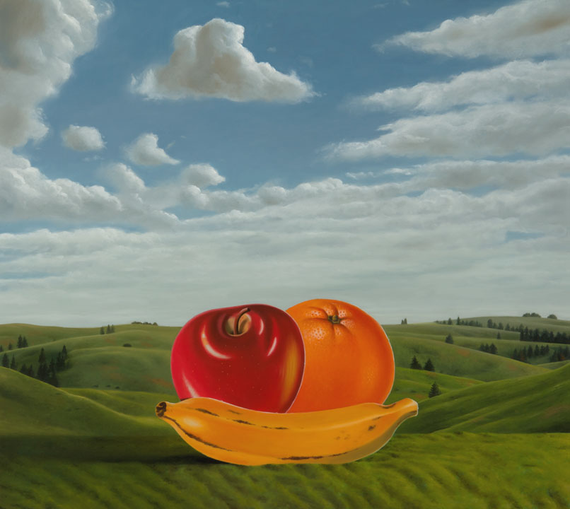 I know, another corny title, but what am I supposed to do. In the back of my mind I make these posts with relative certainty that no one could possibly find them interesting but myself so I am jazzing things up a bit, woo hoo. Here is another painting in my ongoing series of revisiting recent works and changing them dramatically. Produce 20"x 22" oil on panel. Gone is the minimalists background and in with the maximalist.
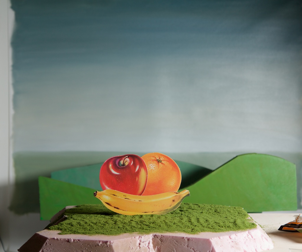 Here is the still life in my studio to give an idea of how I was/am setting up paintings. Strangely, I now think the photos work really well and might someday be an avenue I explore. But for now this is where I am.


