Blog - On the Easel
A collection of updates, recent information and things that inspire me.
Horns on Blue.... Re-Do
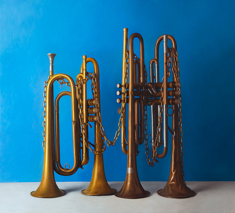
From time to time I will get a painting back from a gallery that for whatever reason didn't find a home. I know that shouldn't affect my feelings towards my painting but it does, and often I will try and figure out exactly what isn't working, it might be the frame, or maybe the wrong gallery with a clientele that doesn't care for the painting or maybe the painting just doesn't work as well as it could. This painting "Chained Melody" is 33"x35" and frankly, I love it, it is a painting that if I could afford to keep I would but... it eats light. I did a bit of glazing on this painting and just like a stained glass window if this painting doesn't get a bunch of light it looks black, or at least too dark. This first picture shows a few of the changes I have begun to make in the painting, first of all the blue went a lot lighter and more towards a cerulean than the ultramarine it was. I am also kicking up the brassy golden color in the horns, at this point I have done the first two horns and you can see how big the change is particularly when looking at the noisy end of the trumpets. The changes will add another week of work into a painting that already has a month in it so far, but so far I am really happy with the improvements I've made.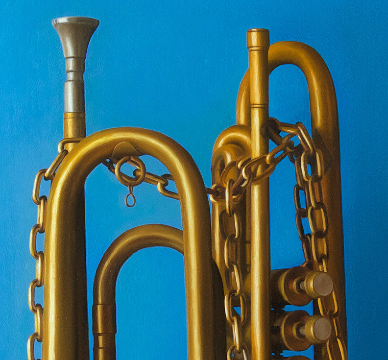
Here is a detail, not quite there yet but it doesn't feel too dark anymore.
And, here is what the painting looked like last week, you can see that the brass looks a bit more tarnished and the still life starts getting lost in the dark blue color on the right side of the painting. I'm keeping my fingers crossed that it will be worth all of the extra work.
Step By Step - Candy Apple
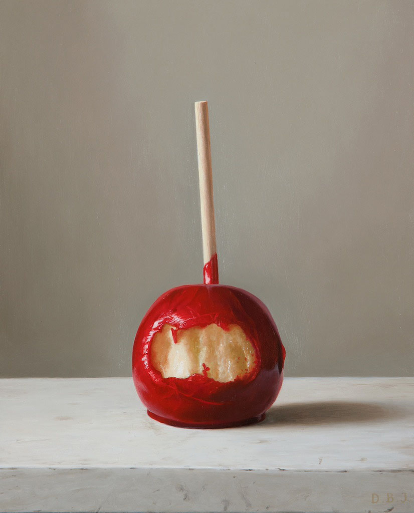
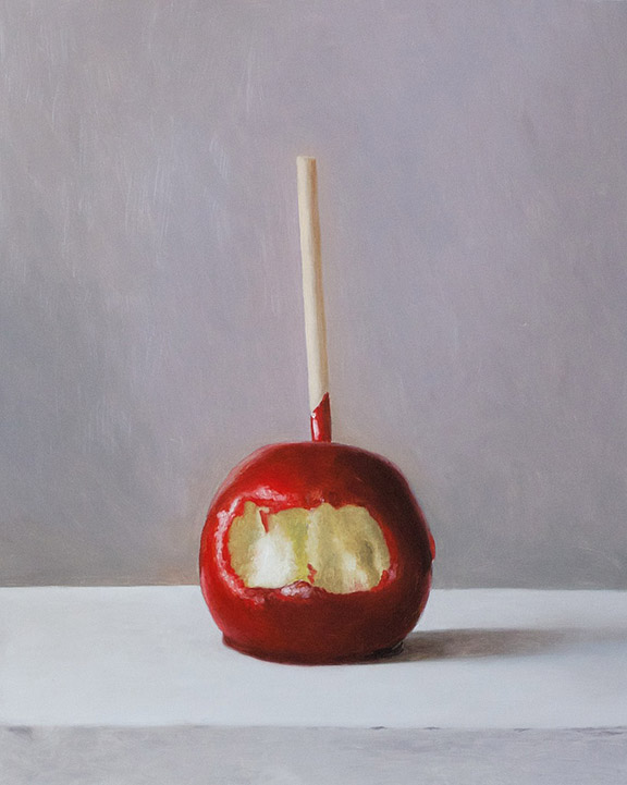
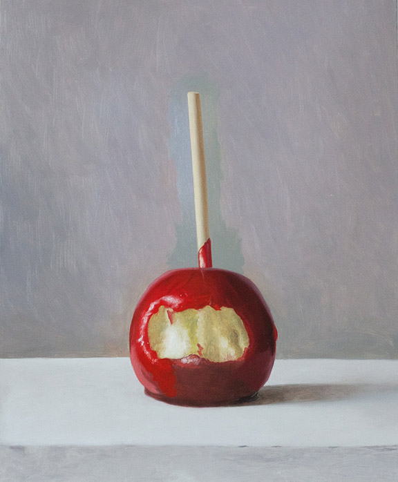
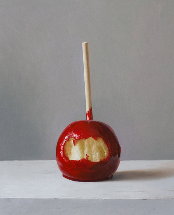
 Here is a recent painting that I photographed during the painting process to show how I work on a fairly simple piece. The painting is oil on panel and measures 10.5"x 8.5". I haven't yet settled on a name, I don't tend to like names that are too cute so "bitten" might be too much, it might just have to be "candy apple".
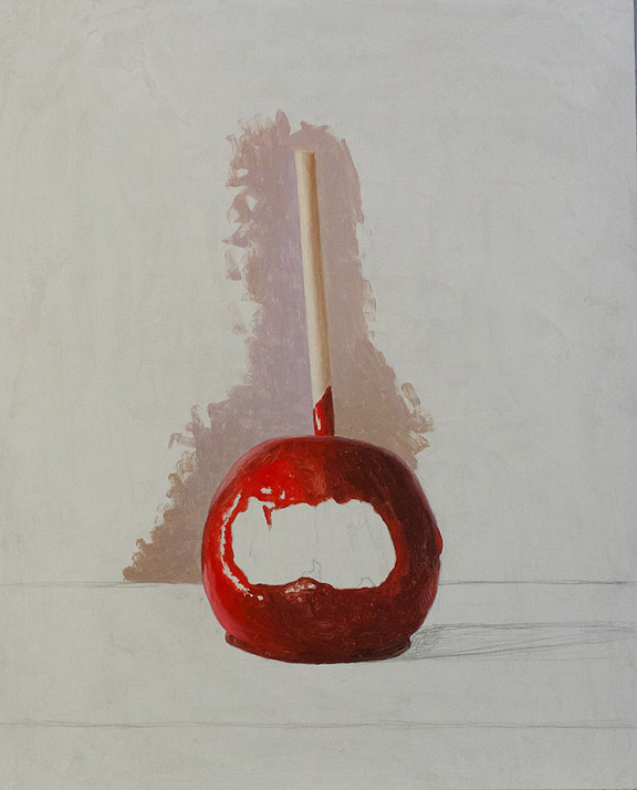
Here is the drawing, I normally don't draw this darkly because I hate having to fight my lines as I paint and pencil can be really difficult to cover up. I sort of try to scrub away the pencil with the brush, so rather than carefully avoiding my lines and filling in like a coloring book I go slightly over them and fix my drawing later if I have to. The background looks blotchy because it is a layer of paint that I have knifed on, I also sanded with emory cloth to give it a bit of a tooth or key before I started.
I am just getting started, I often paint a bit of background so that I can get the values better.
My grays are all over the place, I only mix tiny bits of color at a time. The apple is mostly Cadmium red but in order to keep some intensity in the darks I am using a bit of permanent Alizarin Crimson which I guess is quinacridone red or scarlet.
Finishing the background and starting the tabletop.
First coat finished at this point I look at the painting a lot and try and decide where I went wrong. First coat for me is really about getting the values in the right neighborhood
Starting next coat, the colors start being less dull and I start making a few decisions like making the background cooler rather than the warmer purplish tones. I feel like if a painting is too harmonious it feels dead, like a gauze is covering it. I am starting to draw in some of the crack details in the candy but not very carefully since I will be painting over them anyway. I do that almost as a test to make sure it will work and I wont need another strategy in order to finish the painting.
Second coat pretty much complete, everything should look pretty much how I want it to by now, it just lacks detail and some tweaks to the color.
The stick! This time I don't worry about working wet into wet because I want some crispness.
Tabletop is getting a bit more detail, but as the painting nears completion the changes are more difficult to see. I am really just refining things now. I am shooting with the light from my window onto a point and shoot of an unvarnished painting, so it doesn't look quite as good as it should. I use mostly Old Holland paints, I find that for the way I paint they are reasonably priced. They are very highly pigmented with no filler and most importantly they are stiff paints. You can get great paints like Blockx that are smoother but the stiffness of Old Holland allows me to thin my paints to any consistency without doing anything like setting my paints out on blotter paper. My medium is one part cold pressed linseed to two parts turp with a teensy bit of stand oil added for viscosity.
What a difference a day makes
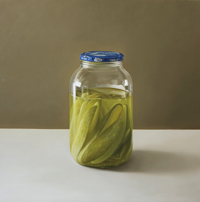 Pickles 21.5"x21.5" oil on wood panel. This is a painting I finished about a year ago and decided to work on again, I was happy with it when I finished, I even had it in a show. But, I kept wondering if the color was right, the painting used to have a brown background and the tabletop was tan wood. The whole painting had a yellowish cast except for the tiny blue cap. I removed the varnish, sanded the painting a bit and decided to fix it. I changed the background to gray and the tabletop to white-ish and kicked up the greens a bit inside of the jar. Since the jar is transparent, the whole painting needed another coat. A new coat is much easier than a new painting, the drawing is already done and paint goes on really nicely over other paint of a similar value. I am really happy with the results. If the painting worked at all before it was the atmospheric murky green water in the jar and how it sort of glows around the pickles and acts like a filter on the pickles within. Getting rid of most of the color in the background now emphasizes the nuclear green as the point of the painting and at least for now I feel like the painting is working a lot better.
Here is what the painting looked like earlier this week. It is funny but I have a phantom color memory of the painting and it is hard for me to look at the painting as it is now with fresh eyes. Sometimes when I look at it it still looks yellowish, hopefully as I get used to the changes I will still like the painting.
F86 SABRE work in progress
 F86 Sabre, oil on panel, 10.5" x 10.5". I am almost finished this one. It is a really shallow Trompe l'oeil so the illusion is fairly convincing. I'm not sure how old the toy is but the plane was popular between 49' and 56'. I guess I was primarily attracted to the goofy futuristic space age graphics in this particular toy. This is another painting in a series I have been working on depicting kitchy or campy objects in an attempt to poke fun at or understand the transformation that happens to objects when they are made into "art".

